There are a lot of lies and bromides on Wall Street. One of the biggest is price is truth.
On the surface it may seem that way, but when you dig deeper you come to realize that price is not truth; persistence is truth.
What is persistence? It is trend. We’ve all heard, “the trend is your friend.”
The trend is your friend until it bends.
My job for subscribers of the Hit & Run Report is to identify when the trend is bending to capitalize on turns.
But what is trend? It all depends on how you define trend.
And, how you define trend has to do with TIME more than price.
Time applied to persistence and trend equates to momentum.
While the trend is your friend; as traders, momentum is our best friend.
It took me 20 years as a trader to get away from only referencing price.
The reason is three-fold:
1) Everyone else is using PRICE to define the markets. And what everyone knows on Wall Street is often not worth knowing. When everyone is doing the same thing, it often pollutes it as a means of analysis.
2) Price is only a reflection of an asset. It’s a reflection versus an asset based on very unstable fiat currencies. For example, since 1959 the money supply in the U.S. has doubled every 10 years. When I was a teenager in NYC, a slice of pizza cost 25 cents. I got a slice here in Malibu yesterday. It was $5.00. There’s not a shortage of the ingredients that go into a pizza. There’s just a vast amount of money. A smoothie down the street cost $6 two years ago. Now its $10.
Sure, there’s no inflation. The Fed says it’s only going to act on “facts,” not forecasts. They’re going to wait for the whites of inflation’s eyes to shoot? The trouble is, if you wait to wait for the whites of your enemies eyes before you fire, you’re dead — they’ve already fired. But I digress.
So price is relative to the amount of money that is circulating, the growth of which is a factor over TIME.
3) We can’t really get away from this. What you have to do is measure things based on a structure of time.
As well, the natural innate character of price is not linear. Price is logarithmic and moves in repetitive cycles.
This is why legendary trader W.D. Gann wrote that “Time is more important than price.”
Yet, how many traders or investors do you know that analyze time and cycles?
We must plot price in relation to a mean of time.
Markets play out in threes. After all, we live in a three dimensional world.
One of the key ways I determine the trend, the Line of Least Resistance, is the 3 Week Chart.
Let’s look at an example of how the 3 Week Chart reveals the underlying structure using GDXJ plotted from its peak last August.
In early August, GDXJ left a weekly Topping Tail and continued to work lower. Once it went 3 weeks without setting a new high, there was a strong likelihood that it would continue lower until it turned its 3 Week Chart down. This occurs when there are 3 consecutive lower weekly lows (not on a closing basis… but each week has to plot lower than the preceding week until you have 3 consecutive lower weekly lows).
It took THREE months for GDXJ to turn its 3 Week Chart down — in late November 2020.
The turn down in the 3 Week Chart perpetuated a rally phase that saw the 3 Week Chart turn back up.
As well, it elicited a “breakout” over a declining weekly trendline.
It proved to be a false breakout with GDXJ failing to close above “the line.”
The failure led to another turndown of the 3 Week Chart on the week of January 18 (point A).
This second turndown of the 3 Week Chart since the August peak perpetuated another Knee Jerk rally — versus a sustained/persistent trend in price.
This is the significance of the 3 Week Chart: when the trend is up or turning up, a turn down in the 3 Week Chart will define a low.
When the trend is down, it may only lead to a Knee Jerk rally — if that.
The 3 Week Chart remained pointing down until two weeks ago when it turned back up, immediately coinciding with a high.
However, the turn up two weeks ago had a different complexion (and bullish) because April saw GDXJ close back above the Line of Most Resistance.
Moreover, April was only the second time GDXJ closed above this Line of Most Resistance.
Long time readers are familiar with my concept that in trading, as in life, the second mouse gets the cheese.
The first mouse gets the squeeze (January’s false breakout that squeezed bulls all the way through March); the second mouse gets the cheese.
GDXJ shows a conspicuous change in character following the recent turn up in the 3 Week Chart — a bullish change in character.
Notice that the Weekly Swing Chart turned down last week but that this turndown immediately defined a low and now the weeklies have turned back up. As well, notice that the turn down in the weeklies last week simply backtested our aforesaid Line of Most Resistance. Potentially bullish. GDXJ looks like it's following through on that bullish potential.
In sum, clearing and closing over the 3 Week Chart turn up from two weeks ago at 51.19 will issue a Time Trend Turn buy signal.
This is a big picture buy signal.
All trading is contextual, and this sequence is playing out BELOW the 200 day moving average and within the context of a inverse Head & Shoulders bottoming pattern.
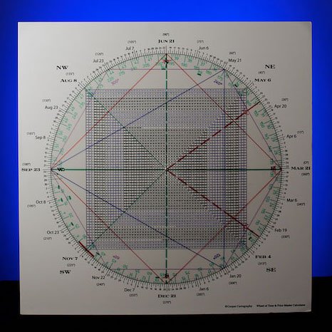
The other way I measure price with a time component is the Principle of Squares.
On the Square of 9 Wheel below, notice that from the 43 low (purple) 90 degrees up and square is 51 (green).
Another 90 degree decrement up is 57 (blue).
However, the magic of the Square of 9 Wheel is that it marries Time & Price (which is how we started this article).
Pulling back the lens shows that these “squares” of price vibrate off May 6 for an inflection point. The metals exploded.
Upside follow through above 51 opens the door to an electric advance.
Pulling back the lens shows that these “squares” of price vibrate off May 6 for an inflection point. The metals exploded.
Upside follow through above 51 opens the door to an electric advance.